
Illustration process for Athleta
Hi friends,
I’m excited to hand pick a project I have worked on recently and do a bit of a deep dive into my process for creating a typical illustration assignment. This is a tote illustration that I created for the fashion brand, Athleta. They were bought by GAP and opening up a new location in Edmonton, Alberta. So, they came to an Edmonton illustrator to develop a tote illustration for celebrating the store opening!
We started by reviewing the company brand values and chatting about any ideation directions. We settled on the idea of blending concepts of being active, women empowerment, sustainability, and a peppering of Edmonton visual cues.
The technical specs for the project were simple: 1 colour, high contrast/silkscreen-able onto a canvas tote.
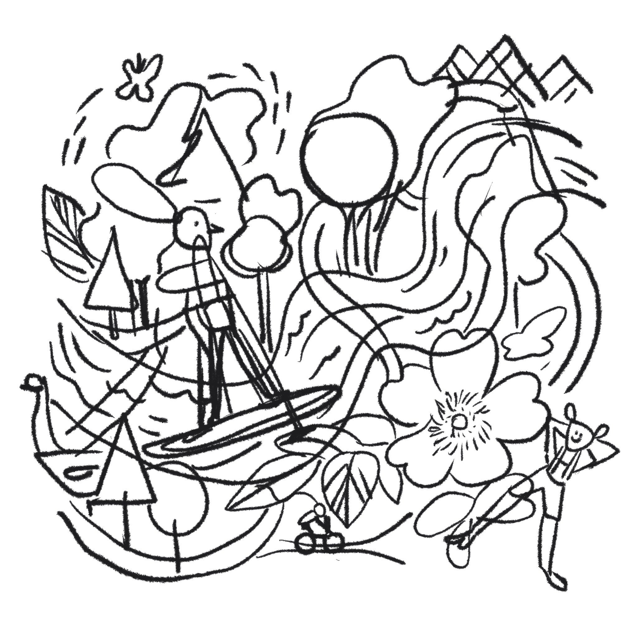
This first concept went to the graveyard… although I like it as it shares ideas about our amazing trails in Edmonton. For those of you know me I am often in the Edmonton river valley on my bike and our trail system is one of the biggest in North America. The style was a bit too youthful and busy, so we moved on.
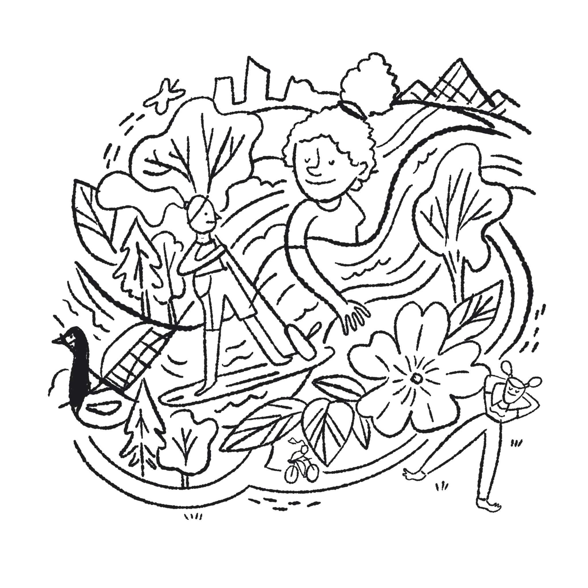
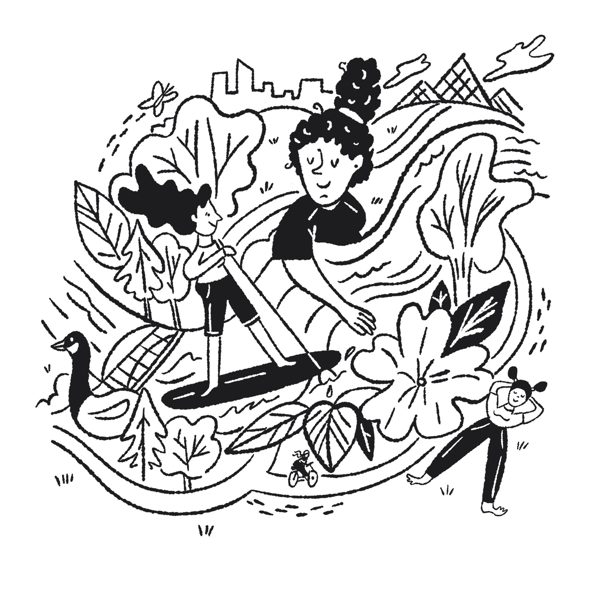
Side note: when I make a sketch, I’ll do it many times over and refine each time, you can see the process above to understand that. To be clear, I would show a rougher iteration to a colleague or someone who is familiar with illustration process. With new clients or clients who do not hire an illustrator regularly, I send a tighter sketch (right). It helps them visualize the final product a bit better!
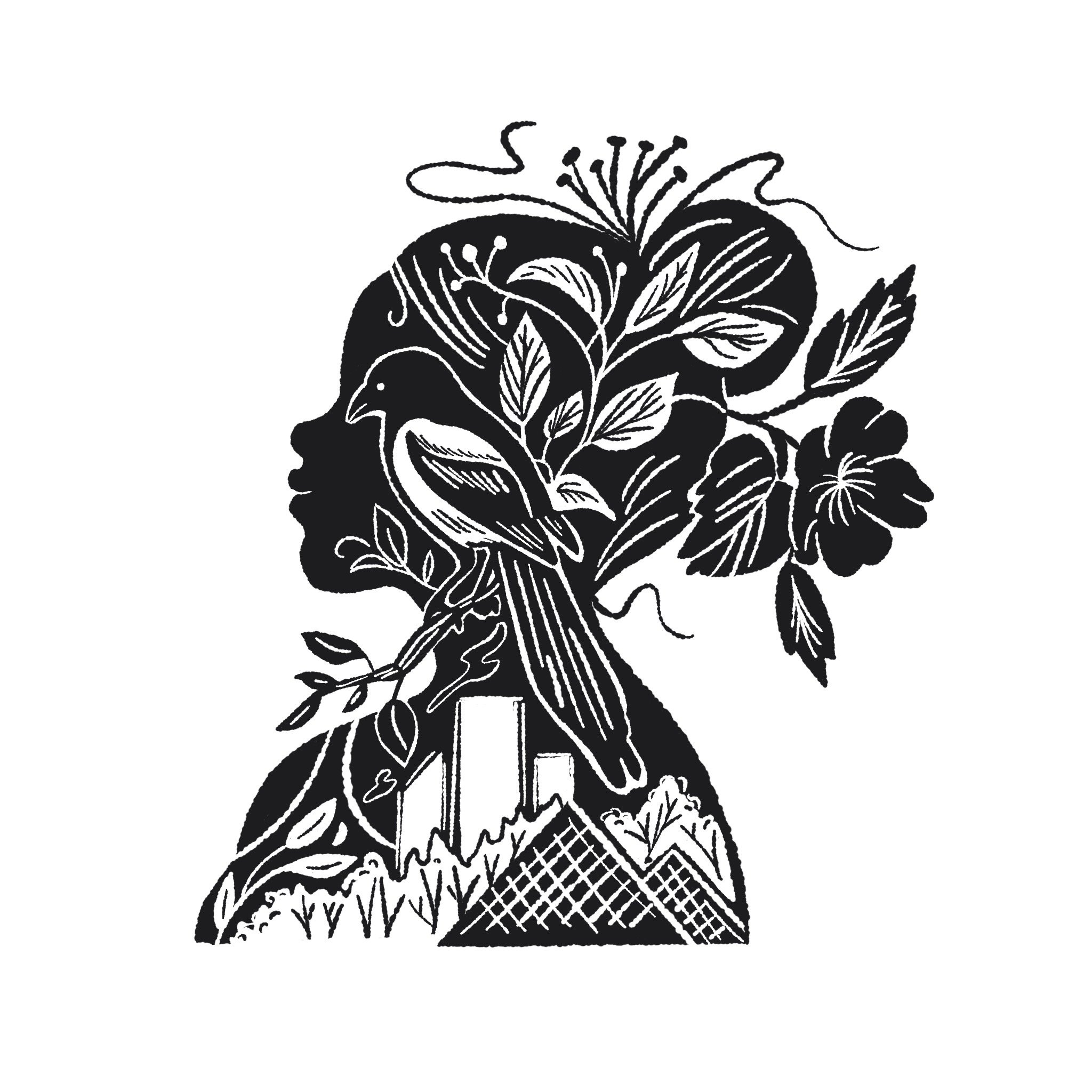
The next concepts were well received but after some back and forth, we decided to move away from a character based concept. Athleta takes great care with providing inclusive sizing in the clothing line. While these concepts are nice looking, they showcase a narrow and potentially insensitive view of all the beautiful bodies that wear the clothing! It was a good note to consider and bring forward to similar future assignments. I love being able to learn new ways to adjust my work so different demographics of people feel seen or celebrated in my work.
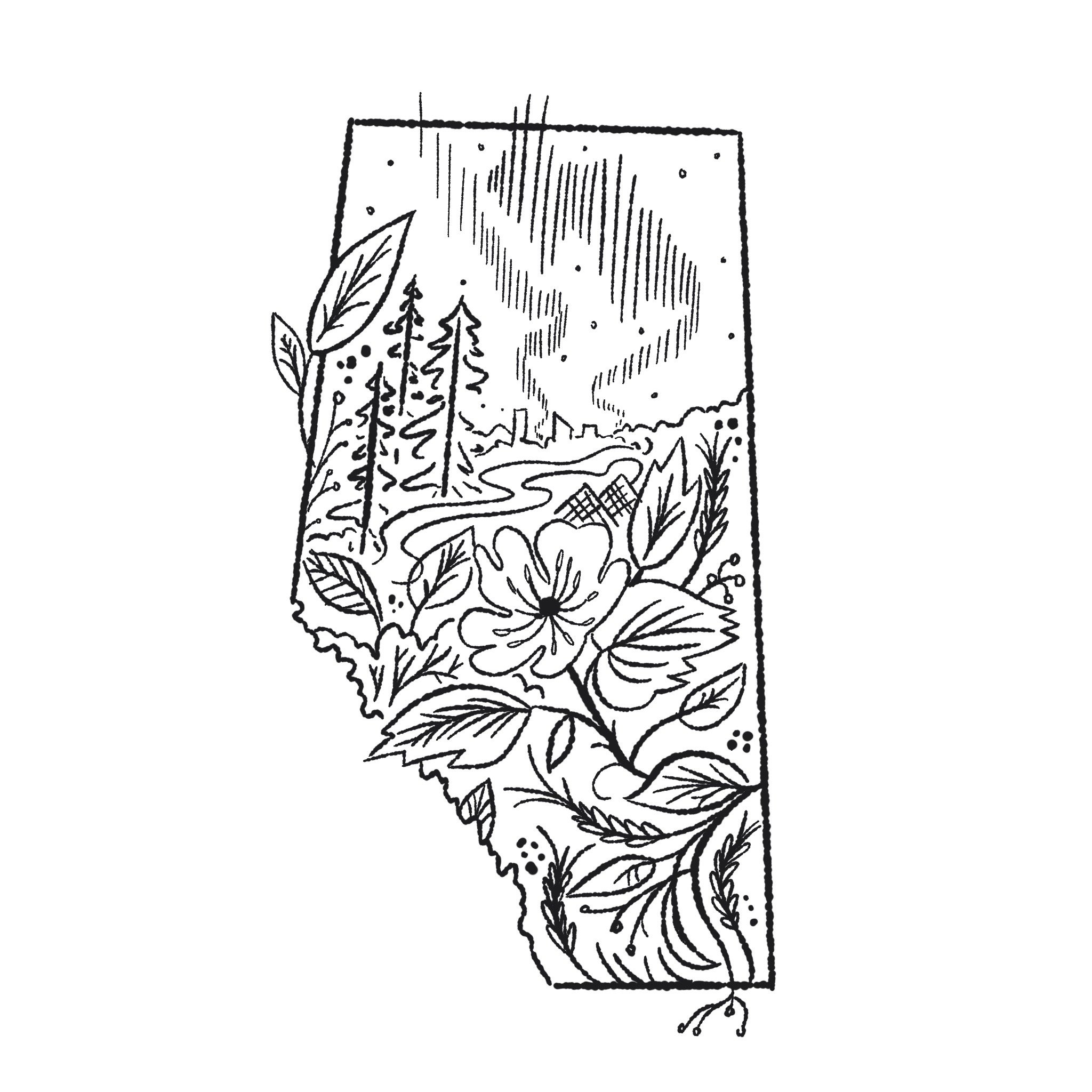
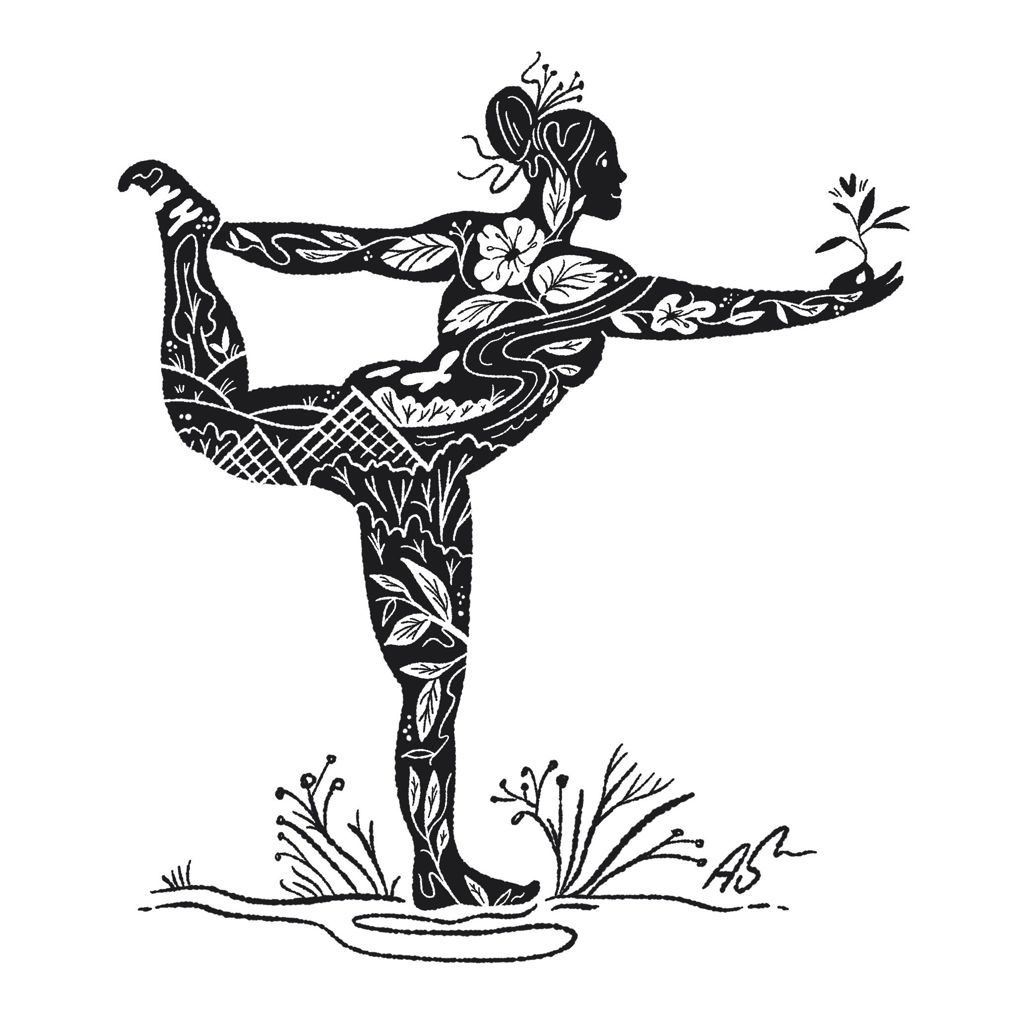
This is the final set of sketches showcase the concept my client selected.
We stuck to celebrating the environmental splendour of the province with the wild rose, wheat, coniferous trees and northern lights. Edmonton and our river peek through as a nod to the new store location.

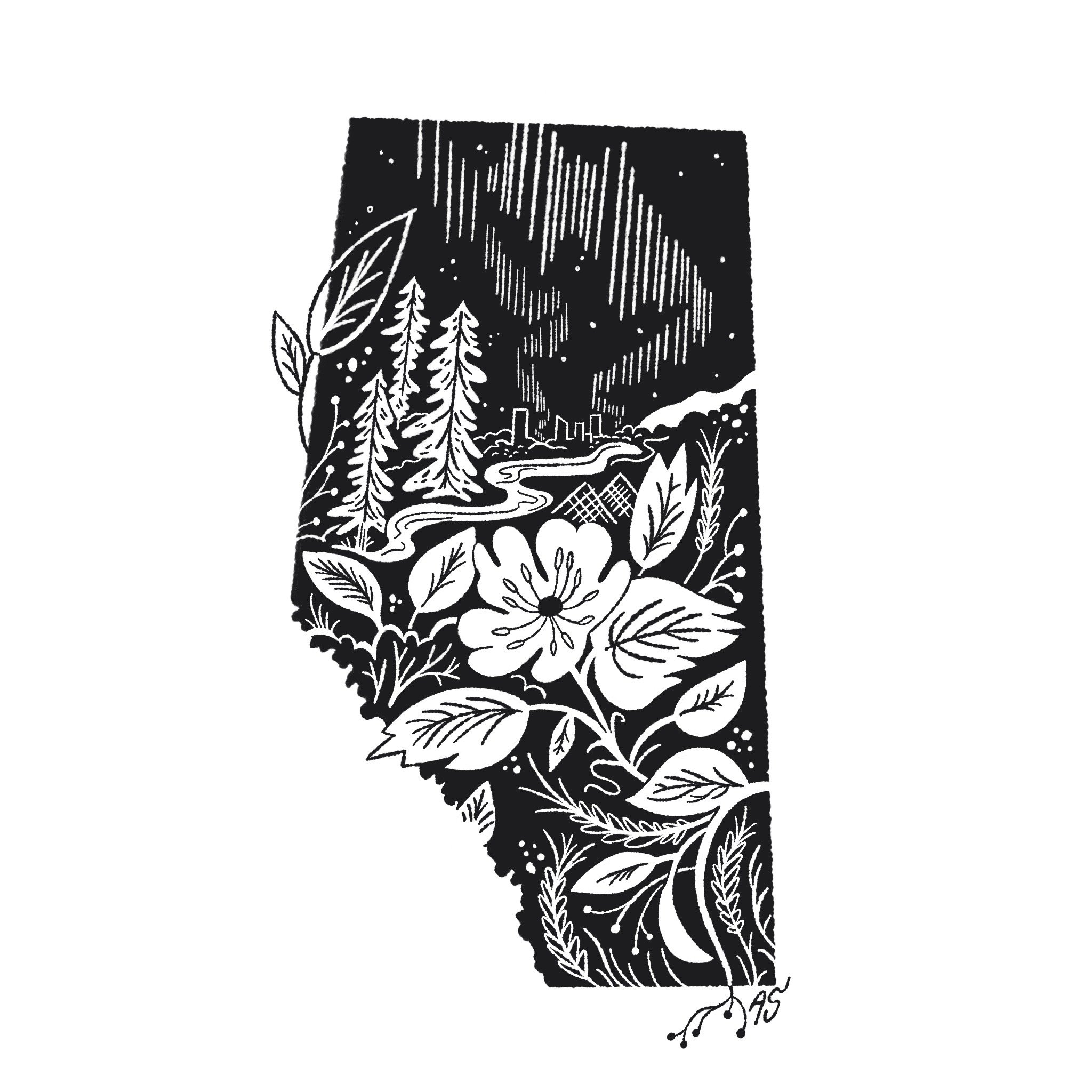
Illustration in application, in one of the Athleta brand colours.
Thanks for following along!